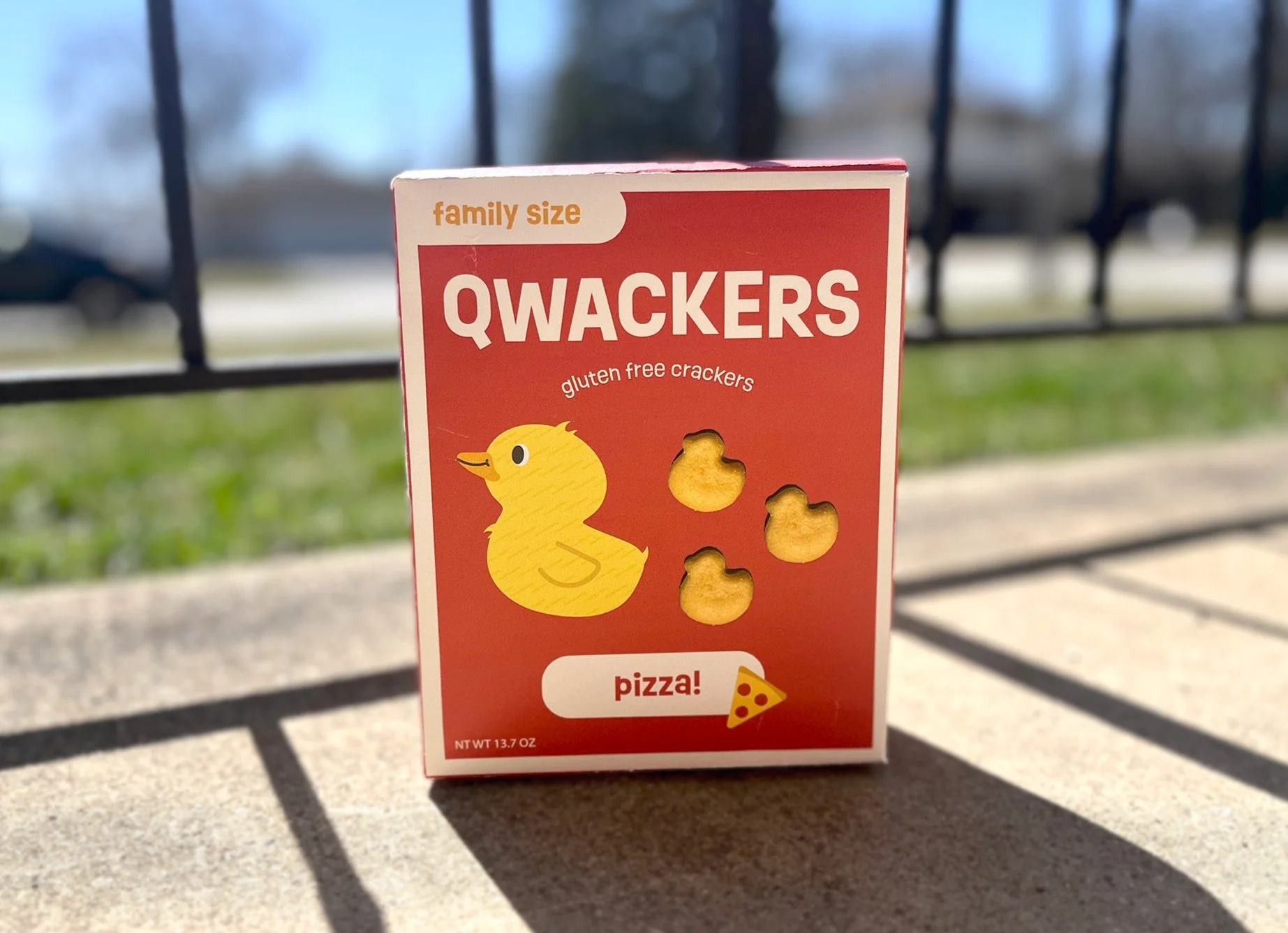
Qwackers
Objective: Rebrand food packaging in need of a refresh, then design, print, and assemble the new packaging. Design a website and mobile layout for the brand.
Role: Packaging design, Web design, UX design
Tools: Adobe Illustrator, Adobe Photoshop, Procreate
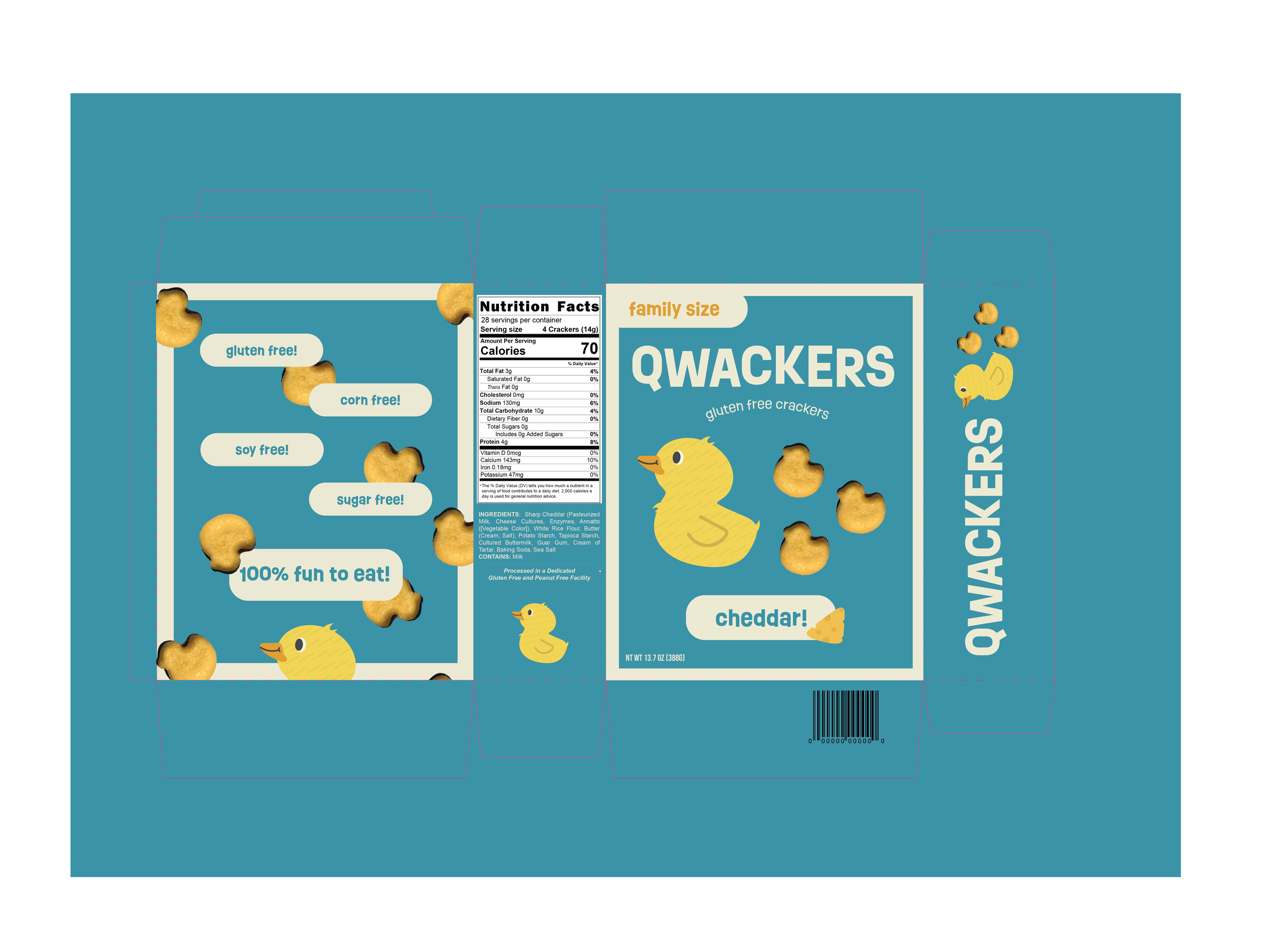
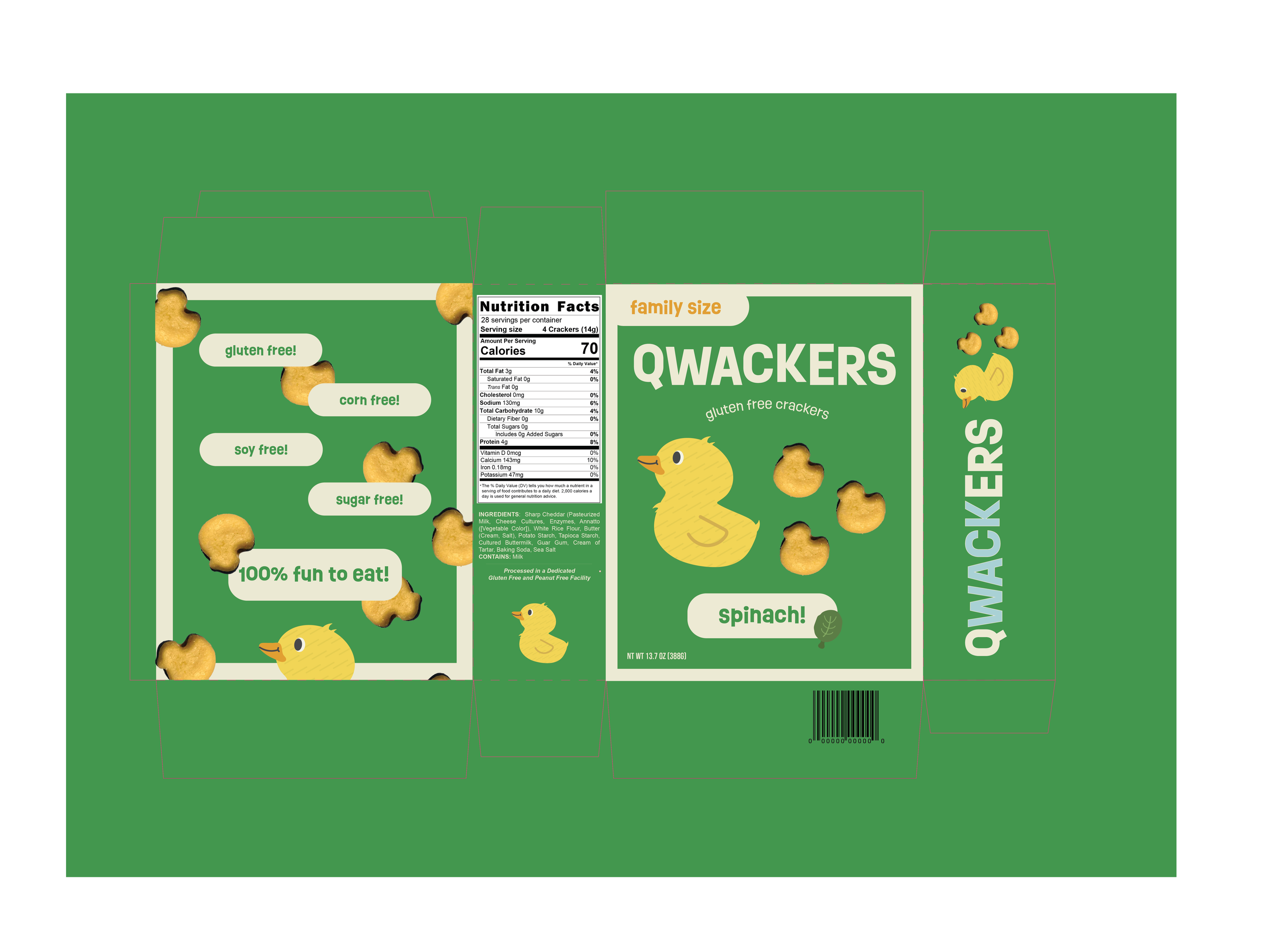
Qwackers is a local brand that makes duck-shaped crackers for kids with food allergies. I reimagined their packaging with a fresh, playful look and incorporated my own illustration of a duck leading a trail of crackers (just like real ducklings!) to highlight the product in a fun, whimsical way.
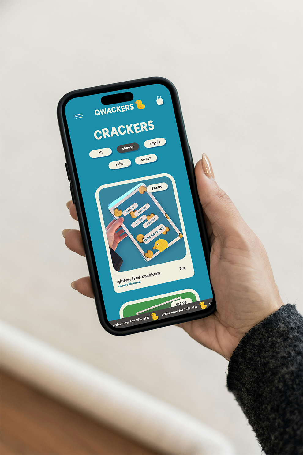
As an extra challenge, I also designed a Qwackers website for both laptop and mobile to show how the product could live and sell online.